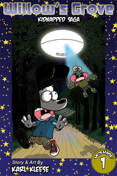
Mock-up Cover For Volume 1 Book
Hey Grovers! Thought I’d share with you the mock-up of the cover of the book I am in the planning stages of putting together for sale. Right now I am in the mock-up stage, as you can tell by the title of this blog entry, so the cover is nearly final but not quite…there is still some tweaking room.
I’m still not settled on the star background and might go with the background for the website, since I am using the font for the site. Let me know what you all think about either the current background design for the cover or using the starry background of the website for it.
 Stumble it!


looks good overall, honestly id go with the site background instead of the current stars.
Thanks for the input…I am also leaning towards the website background or a slightly modified version (if I can remember how I created it in the first place…was a bit of experiment I failed to document the steps to…lol) 🙂
I have to concur with KW on this one. However, I do tend to wonder how well the websites background will do used in print format?!? You also have an array of cosmic backgrounds from the individual comics themselves, maybe try some of those before you pick a final one?